.png)
The differences between Lettering, Calligraphy, and Typography
If you spend enough time in the design world, especially online, you’ll notice that people constantly mix up lettering, calligraphy, typography, and type design. Sometimes they get used interchangeably, sometimes people think they’re all the same thing, and sometimes designers accidentally label one thing as another.
I used to see this happen a lot when I started sharing my work online. Someone would call a custom lettering piece “typography”, or refer to a hand-drawn logotype as “calligraphy”. It’s understandable because these disciplines overlap visually, but they’re actually very different practices with different intentions behind them.
So here’s a simple breakdown of what each one really is.
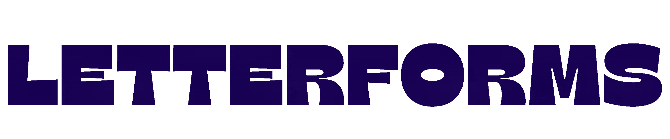
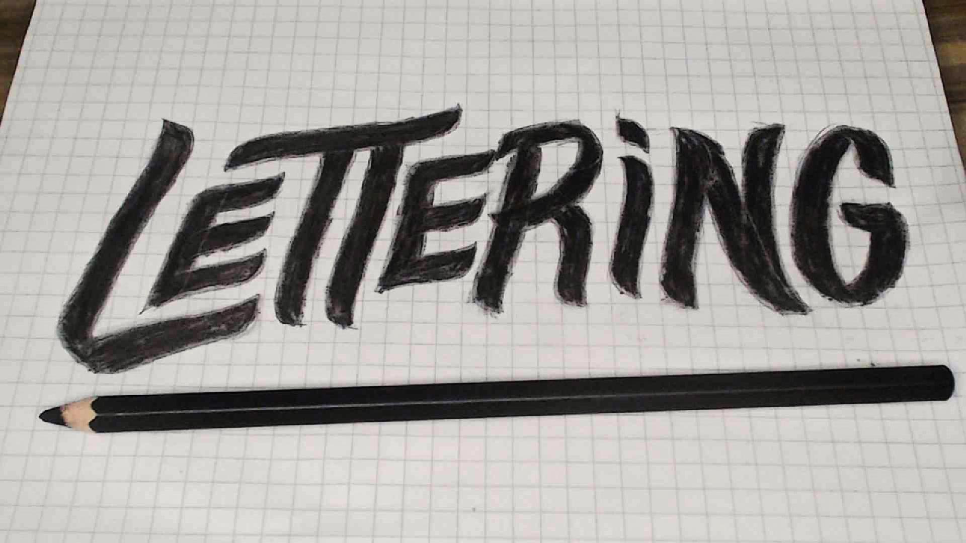
Lettering
Lettering is drawing letters. Not writing them. Drawing them.
When I work on a lettering piece or a custom logotype, I’m not thinking about creating a reusable font system. I’m crafting a specific arrangement of letterforms for one word, phrase, or composition. Every letter is treated like an illustration.
That’s why lettering often feels more expressive, stylised, and unique. The letters are usually custom built for that exact piece.
A good way to think about it is this:
If you erase one letter and redraw it completely differently, the piece still works because it was never meant to function as a full alphabet system in the first place.
Lettering lives a lot in branding, album covers, packaging, posters, murals, and identity work. It’s also why custom logotypes tend to feel more distinctive than logos made from existing fonts.
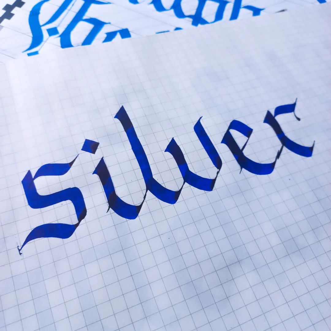
Calligraphy
Calligraphy is the art of beautiful writing.
Unlike lettering, calligraphy is created through movement and strokes. It’s performance-based in a way. The tool matters a lot here. The pen angle matters. Pressure matters. Rhythm matters.
With calligraphy, the forms are created naturally through writing rather than constructed slowly like an illustration.
A lot of modern designers get introduced to letters through brush calligraphy first because it feels accessible and expressive. That was true for many creatives online over the last decade.
Calligraphy can sometimes become the foundation for lettering work too. Many lettering artists sketch with calligraphic influences before refining everything digitally.
But they’re still different disciplines.
One is written.
One is drawn.
Typography
Typography is probably the broadest term of the four.
Typography is the arrangement and use of type.
So when a designer chooses fonts, adjusts spacing, creates hierarchy, lays out text in a magazine, or builds a website interface, that’s typography.
You do not need to create letters from scratch to practise typography.
Typography is more about how type is used rather than how it’s created.
Good typography is invisible in the best way. You notice when it’s bad immediately, but when it’s done well, the reading experience feels natural and effortless.
A lot of people mistakenly call any text-based design “typography”, but typography itself usually relies on existing typefaces.
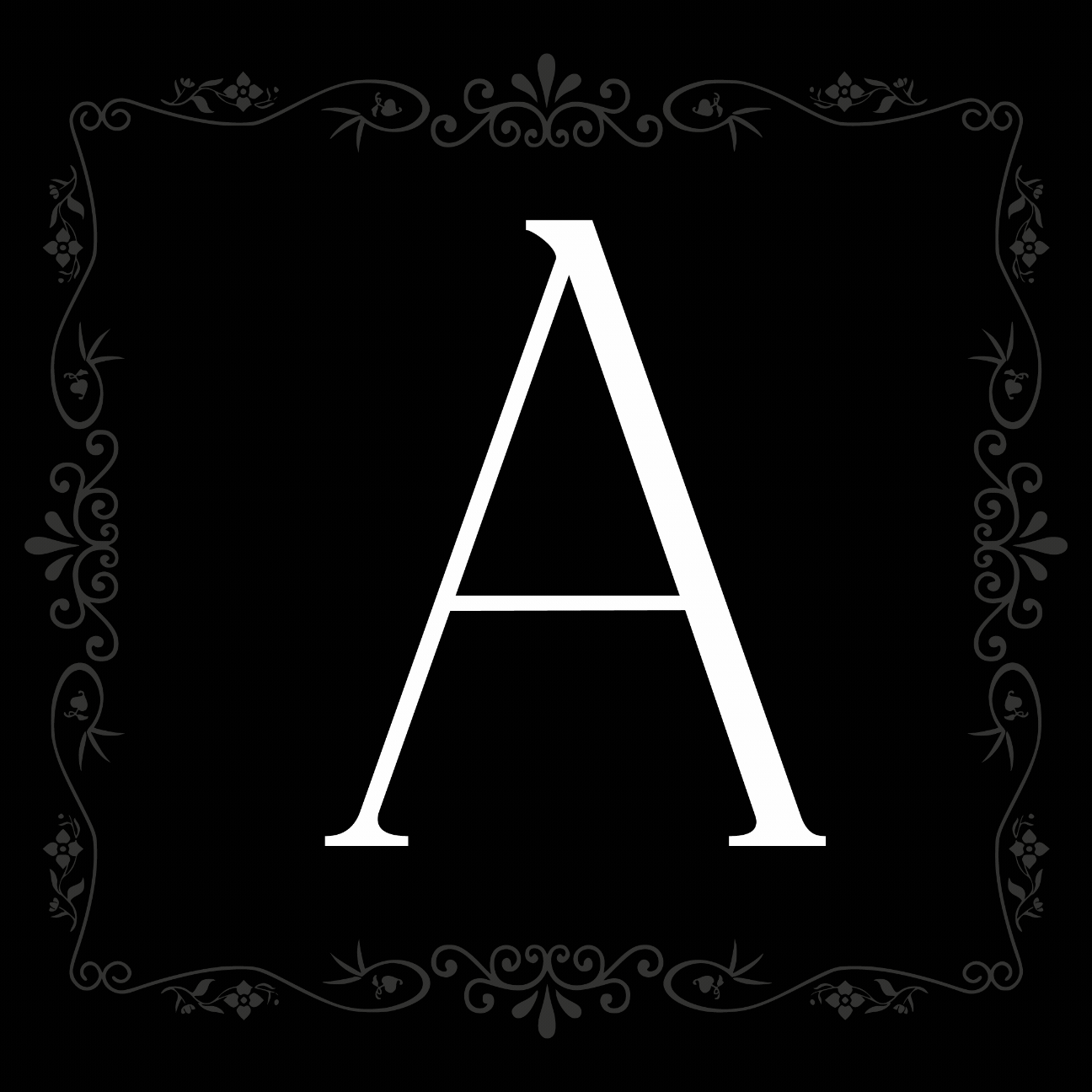
Type Design
Type design is the process of creating typefaces.
This is probably the most technical discipline of the four because you’re building an entire system, not just individual beautiful letters.
Designing one good “A” is difficult.
Designing a full alphabet where every character works together consistently is an entirely different challenge.
Type designers think about spacing, kerning, language support, readability, interpolation, weights, functionality, and how letters behave across hundreds of combinations.
This is why type design takes so much patience.
You’re not designing isolated letters.
You’re designing relationships between letters.
A typeface has to function as a system that people can repeatedly use across different contexts.
Why These Differences Matter
I think understanding these distinctions helps designers communicate their work more clearly, but it also helps people appreciate the skill behind each discipline.
A lettering artist is solving a different problem from a type designer.
A calligrapher approaches form differently from a typographer.
They overlap constantly, and many creatives practise more than one of them, but the mindset behind each one changes everything.
Personally, I love existing somewhere between lettering, branding, and type culture because all of them influence each other. A lot of my approach to logotype design comes from understanding type systems, even if I’m ultimately drawing custom forms.
At the end of the day, they’re all connected through one thing:
Letters shape how we experience the world visually.
And once you start paying attention to them properly, you can’t unsee them anymore.